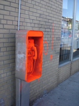
The public telephone at the south west corner of Dundas St. West and Pacific Ave. has been painted orange recently; while it looks nice as an orange patch it does nothing for the perceived value of the community towards itself.
This does not appear to be a Bell Canada pay telephone, which causes wonder how long it will stay this way.


20 Comments
plus the new graffiti on the wall beside the phone… sad
that phone has been dead for years.
Maybe if there was an upkeep of these phones (another of this same brand is broken and dangling on the North East corner of Dundas/Keele) there wouldn't be an issue of vandalism.
I've seen abandoned bicycles painted by people so that they get removed, and that might have been why this was done. As Theirry says, phones have to be maintained by Bell so that we don't end up with such blight.
A.R. makes a good point, this might be some kind of urban guerrilla tactic to bring our attention to a fine example of urban scrap. I’ve walked by this phone hundreds of times and never noticed it before but I will now.
If I had to guess though I would says its probably more graffiti and less urban activism.
AR; I believe these are not Bell phones but another company that has long since gone defunct
Martin; I believe in the end this is someones idea of "art". And as most know, art is subjective
I also believe that i overused the word believe in my reply, if you can believe it.
I would guess art, let's see if other things start appearing in bright colours. Maybe we don't know the big picture yet.
I like it.
The practice started in Detroit by painting the abandoned houses bright orange so that people would notice and have them removed before they collapsed and hurt someone. Someone must have learned about it, and is using the same tactic for: "Look at this! It's abandoned and doesn't work, don't ignore it get Rid of it." (usually works too)
pay phones… what antiques. I am loving the poster of the apple bottomed tennis player woman on the southeast corner of Pacific/Dundas. Those posters are poping up all over and I like it!
You like it? I'm starting to get sick of one local business taking over public and private spaces to promote itself.
what business is this?
What businesses are you talking about? This is the artist http://fauxreel.ca/ and those are not graffitti but appliques, they come off gradually with weather or can easily be taken off by hand, but I love seeing them everywhere..
So arts ok, but only if its in a gallery right? lol
Street is his gallery and he doesn't damage private/public property
I think Junction Resident is implying that the bar Margaret is responsible because they have also done a few posters in this style. It's not. What's nicer: a big grey box or a big grey box with an uplifting and funny image on it?
Art is in the eye of the beholder. I think Impressionism is boring to look at and prefer modern guerrilla art.
SO SUE ME!
It looks like a Banksy piece, I like it alot.
Advertising isn't art. Postering mailboxes isn't art. Free advertising isn't free if it costs the public.
I wasn't implying that this was done BY Margaret, although it is in the same style, but that's the business I had in mind. I'm sure if Margaret had done this, it would have had their name on it.